

Vue3 Carousel is a content slider featuring various customization options. It supports Vue 3 with PrimeVue 3 and Vue 2 with PrimeVue 2.
Setup
Refer to PrimeVue setup documentation for download and installation steps for your environment such as Vue CLI, Vite or browser.
Import
import Carousel from 'primevue/carousel';
Getting Started
Carousel requires a collection of items as its value along with a template to render each item.
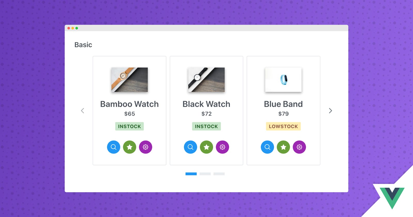
<Carousel :value="cars">
    <template #item="slotProps">
    </template>
</Carousel>
Items per page and Scroll Items
Number of items per page is defined using the numVisible property whereas number of items to scroll is defined with the numScroll property.
<Carousel :value="cars" :numVisible="3" :numScroll="1">
    <template #item="slotProps">
    </template>
</Carousel>
Responsive
For responsive design, numVisible and numScroll can be defined using the responsiveOptions property that should be an array of objects whose breakpoint defines the max-width to apply the settings.
<Carousel :value="cars" :numVisible="4" :numScroll="3" :responsiveOptions="responsiveOptions">
    <template #header>
        <h2>Basic</h2>
    </template>
    <template #item="slotProps">
        <div class="car-item">
            <div class="car-content">
                <div>
                    <img :src="'demo/images/car/' + slotProps.data.brand + '.png'" :alt="slotProps.data.brand" />
                </div>
                <div>
                    <div class="car-title">{{slotProps.data.brand}}</div>
                    <div class="car-subtitle">{{slotProps.data.year}} | {{slotProps.data.color}}</div>

                    <div class="car-buttons">
                        <Button icon="pi pi-search" class="p-button-secondary" />
                        <Button icon="pi pi-star" class="p-button-secondary" />
                        <Button icon="pi pi-cog" class="p-button-secondary" />
                    </div>
                </div>
            </div>
        </div>
    </template>
</Carousel>
data() {
    return {
        responsiveOptions: [
            {
                breakpoint: '1024px',
                numVisible: 3,
                numScroll: 3
            },
            {
                breakpoint: '600px',
                numVisible: 2,
                numScroll: 2
            },
            {
                breakpoint: '480px',
                numVisible: 1,
                numScroll: 1
            }
        ]
    }
},
Header and Footer
Custom content projection is available using the header and footer templates.
<Carousel :value="cars" :numVisible="3" :numScroll="1" :responsiveOptions="responsiveOptions">
    <template #header>
        <h2>Custom Header</h2>
    </template>
    <template #item="slotProps">
        Content
    </template>
    <template #footer>
        <h2>Custom Footer</h2>
    </template>
</Carousel>
Orientation
Default layout of the Carousel is horizontal, other possible option is the vertical mode that is configured with the orientation property.
<Carousel :value="cars" :numVisible="1" :numScroll="1" orientation="vertical" verticalViewPortHeight="330px" :responsiveOptions="responsiveOptions">
    <template #item="slotProps">
        Content
    </template>
</Carousel>
AutoPlay and Circular
When autoplayInterval is defined in milliseconds, items are scrolled automatically. In addition, for infinite scrolling circular property needs to be enabled. Note that in autoplay mode, circular is enabled by default.
<Carousel :value="cars" :numVisible="3" :numScroll="1" :circular="true" :autoplayInterval="3000">
    <template #header>
        <h2>Circular, AutoPlay</h2>
    </template>
    <template #item="slotProps">
        Content
    </template>
</Carousel>
Theming
Carousel supports various themes featuring Material, Bootstrap, Fluent as well as your own custom themes via the Designer tool.
Resources
Visit the PrimeVue Carousel showcase for demos and documentation.