

Vue Button is an extension to standard button element with icons and theming. It supports Vue 3 with PrimeVue 3 and Vue 2 with PrimeVue 2.
Setup
Refer to PrimeVue setup documentation for download and installation steps for your environment such as Vue CLI, Vite or browser.
Import
import Button from 'primevue/button';
Getting Started
Button is created using the Button element.
<Button />
Label
Text of the button is defined using the label property.
<Button label="Submit" />
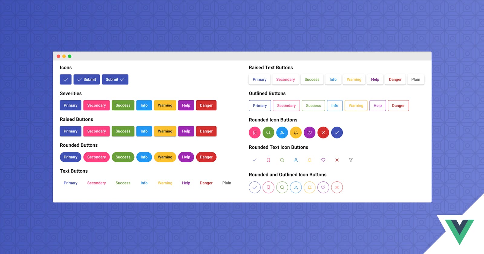
Icons
Icon on a button is specified with icon property and position is configured using iconPos attribute. Default icon position is "left" and alternative is "right". To display only an icon, leave the label as undefined.
<Button label="Submit" icon="pi pi-check" iconPos="right" />
Events
Events are defined with the standard notation.
<Button label="Submit" @click="handleClick($event)"/>
Severity
Different options are available as severity levels.
- .p-button-secondary
- .p-button-success
- .p-button-info
- .p-button-warning
- .p-button-help
- .p-button-danger
<Button label="Primary" />
<Button label="Secondary" class="p-button-secondary" />
<Button label="Success" class="p-button-success" />
<Button label="Info" class="p-button-info" />
<Button label="Warning" class="p-button-warning" />
<Button label="Warning" class="p-button-help" />
<Button label="Danger" class="p-button-danger" />
Text Buttons
Text buttons have transparent background and borders, use p-button-text to apply text button styling. In addition when used with .p-button-plain text buttons ignore severity levels and displayed as a regular text.
<Button label="Submit" class="p-button-text" />
<Button icon="pi pi-check" class="p-button-text" />
<Button label="Cancel" icon="pi pi-times" class="p-button-text" />
<Button label="Search" icon="pi pi-search" iconPos="right" class="p-button-text p-button-text" />
Raised and Rounded Buttons
A button can be raised by having "p-button-raised" style class and similarly borders can be made rounded using "p-button-rounded" class.
<Button label="Primary" class="p-button-raised p-button-rounded" />
Outlined Buttons
An alternate styling for a button is the outlined option where background becomes transparent. Apply "p-button-outlined" to style a button as outlined.
<Button label="Primary" class="p-button-outlined" />
Link Buttons
Use "p-button-link" class to render the button as a link.
<Button label="Link" class="p-button-link" />
Badges
Badge is a small status indicator for a button. Refer to the badge documentation for available styling options.
<Button type="button" label="Emails" badge="8" />
<Button type="button" label="Messages" icon="pi pi-users" class="p-button-warning" badge="8" badgeClass="p-badge-info" />
ButtonSet
Wrapping the buttons in a container having a .p-buttonset class, groups the buttons side to side.
<span class="p-buttonset">
    <Button label="Save" icon="pi pi-check" />
    <Button label="Delete" icon="pi pi-trash" />
    <Button label="Cancel" icon="pi pi-times" />
</span>
Sizes
2 more sizes are available in addition to a regular button, for a smaller input add p-button-sm and for a larger one, use p-button-lg. Note that these classes available to change the size of a particular button, for global scaling see the theming page.
<Button label="Small" icon="pi pi-check" class="p-button-sm"  />
<Button label="Normal" icon="pi pi-check" class="p-button"  />
<Button label="Large" icon="pi pi-check" class="p-button-lg" />
Slot
Custom content can be placed inside the button via the default slot. Note that when slot is used, label, icon and badge properties are not included.
<Button>
    Custom Content
</Button>
Theming
Button supports various themes featuring Material, Bootstrap, Fluent as well as your own custom themes via the Designer tool.
Resources
Visit the PrimeVue Button showcase for demos and documentation.