

React DataTable displays data in tabular format.
Setup
Refer to PrimeReact setup documentation for download and installation steps for your environment.
Import
import { DataTable } from 'primereact/datatable';
Getting Started
DataTable requires a value as an array of objects and columns defined with Column component. Throughout the samples, a product interface having code, name, description, image, category, quantity, price, inventoryStatus and rating properties is used to define an object to be displayed by the datatable. Products are loaded by a CustomerService that connects to a server to fetch the products with a axios. Note that this is only for demo purposes, DataTable does not have any restrictions on how data is provided.
import axios from 'axios';

export default class ProductService {

    getProductsSmall() {
        return axios.get('showcase/demo/data/products-small.json').then(res => res.data.data);
    }

    getProducts() {
        return axios.get('showcase/demo/data/products.json').then(res => res.data.data);
    }

    getProductsWithOrdersSmall() {
        return axios.get('showcase/demo/data/products-orders-small.json').then(res => res.data.data);
    }
}
Following sample datatable has 4 columns and retrieves the data from a service on componentDidMount.
export const DataTableDemo = () => {

    const [products, setProducts] = useState([])

    useEffect(() => {
        productService = new ProductService();
        productService.getProductsSmall().then(data => setProducts(data));
    }, [])

    return (
        <DataTable value={products}>
            <Column field="code" header="Code"></Column>
            <Column field="name" header="Name"></Column>
            <Column field="category" header="Category"></Column>
            <Column field="quantity" header="Quantity"></Column>
        </DataTable>
    );

}
Dynamic columns are also possible by creating the column component dynamically.
export const DataTableDemo = () => {

    const [products, setProducts] = useState([]);

    const columns = [
        {field: 'code', header: 'Code'},
        {field: 'name', header: 'Name'},
        {field: 'category', header: 'Category'},
        {field: 'quantity', header: 'Quantity'}
    ];

    useEffect(() => {
        productService = new ProductService();
        productService.getProductsSmall().then(data => setProducts(data));
    }, [])

    const dynamicColumns = columns.map((col,i) => {
        return <Column key={col.field} field={col.field} header={col.header} />;
    });

    return (
        <DataTable value={products}>
            {dynamicColumns}
        </DataTable>
    );
}
Table Layout
Default table-layout is fixed meaning the cell widths do not depend on their content. If you require cells to scale based on their contents set autoLayout property to true. Note that Scrollable and/or Resizable tables do not support auto layout due to technical limitations.
Templates
Field data of a corresponding row is displayed as the cell content by default, this can be customized using templating where current row data and column properties are passed to the body template. On the other hand, header and footer properties of a column are used to define the content of these sections by accepting either simple string values or JSX for advanced content. Similarly DataTable itself also provides header and footer properties for the main header and footer of the table.
export const DataTableTemplatingDemo = () => {

    const [products, setProducts] = useState([])

    useEffect(() => {
        productService = new ProductService();
        productService.getProductsSmall().then(data => setProducts(data));
    }, []);

    const formatCurrency = (value) => {
        return value.toLocaleString('en-US', { style: 'currency', currency: 'USD' });
    }

    const imageBodyTemplate = (rowData) => {
        return <img src={`showcase/demo/images/product/${rowData.image}`} alt={rowData.image} className="product-image" />;
    }

    const priceBodyTemplate = (rowData) => {
        return formatCurrency(rowData.price);
    }

    const ratingBodyTemplate = (rowData) => {
        return <Rating value={rowData.rating} readonly cancel={false} />;
    }

    const statusBodyTemplate = (rowData) => {
        return <span className={`product-badge status-${rowData.inventoryStatus.toLowerCase()}`}>{rowData.inventoryStatus}</span>;
    }

    const header = (
        <div className="table-header">
            Products
            <Button icon="pi pi-refresh" />
        </div>
    );
    const footer = `In total there are ${products ? products.length : 0} products.`;

    return (
        <DataTable value={products} header={header} footer={footer}>
            <Column field="name" header="Name"></Column>
            <Column header="Image" body={imageBodyTemplate}></Column>
            <Column field="price" header="Price" body={priceBodyTemplate}></Column>
            <Column field="category" header="Category"></Column>
            <Column field="rating" header="Reviews" body={ratingBodyTemplate}></Column>
            <Column header="Status" body={statusBodyTemplate}></Column>
        </DataTable>
    );

}
Column Group
Columns can be grouped at header and footer sections by defining a ColumnGroup component as the headerColumnGroup and footerColumnGroup properties.
import React, { Component } from 'react';
import {DataTable} from 'primereact/datatable';
import {Column} from 'primereact/column';
import {ColumnGroup} from 'primereact/columngroup';
import {Row} from 'primereact/row';

export const DataTableColGroupDemo = () => {

    const sales = [
        {product: 'Bamboo Watch', lastYearSale: 51, thisYearSale: 40, lastYearProfit: 54406, thisYearProfit: 43342},
        {product: 'Black Watch', lastYearSale: 83, thisYearSale: 9, lastYearProfit: 423132, thisYearProfit: 312122},
        {product: 'Blue Band', lastYearSale: 38, thisYearSale: 5, lastYearProfit: 12321, thisYearProfit: 8500},
        {product: 'Blue T-Shirt', lastYearSale: 49, thisYearSale: 22, lastYearProfit: 745232, thisYearProfit: 65323},
        {product: 'Brown Purse', lastYearSale: 17, thisYearSale: 79, lastYearProfit: 643242, thisYearProfit: 500332},
        {product: 'Chakra Bracelet', lastYearSale: 52, thisYearSale:  65, lastYearProfit: 421132, thisYearProfit: 150005},
        {product: 'Galaxy Earrings', lastYearSale: 82, thisYearSale: 12, lastYearProfit: 131211, thisYearProfit: 100214},
        {product: 'Game Controller', lastYearSale: 44, thisYearSale: 45, lastYearProfit: 66442, thisYearProfit: 53322},
        {product: 'Gaming Set', lastYearSale: 90, thisYearSale: 56, lastYearProfit: 765442, thisYearProfit: 296232},
        {product: 'Gold Phone Case', lastYearSale: 75, thisYearSale: 54, lastYearProfit: 21212, thisYearProfit: 12533}
    ];

    const lastYearSaleBodyTemplate = (rowData) => {
        return `${rowData.lastYearSale}%`;
    }

    const thisYearSaleBodyTemplate = (rowData) => {
        return `${rowData.thisYearSale}%`;
    }

    const lastYearProfitBodyTemplate = (rowData) => {
        return `${formatCurrency(rowData.lastYearProfit)}`;
    }

    const thisYearProfitBodyTemplate = (rowData) => {
        return `${formatCurrency(rowData.thisYearProfit)}`;
    }

    const formatCurrency = (value) =>  {
        return value.toLocaleString('en-US', {style: 'currency', currency: 'USD'});
    }

    const lastYearTotal = () => {
        let total = 0;
        for(let sale of sales) {
            total += sale.lastYearProfit;
        }

        return formatCurrency(total);
    }

    const thisYearTotal = () => {
        let total = 0;
        for(let sale of sales) {
            total += sale.thisYearProfit;
        }

        return formatCurrency(total);
    }

    let headerGroup = <ColumnGroup>
                        <Row>
                            <Column header="Product" rowSpan={3} />
                            <Column header="Sale Rate" colSpan={4} />
                        </Row>
                        <Row>
                            <Column header="Sales" colSpan={2} />
                            <Column header="Profits" colSpan={2} />
                        </Row>
                        <Row>
                            <Column header="Last Year" sortable field="lastYearSale"/>
                            <Column header="This Year" sortable field="thisYearSale"/>
                            <Column header="Last Year" sortable field="lastYearProfit"/>
                            <Column header="This Year" sortable field="thisYearProfit"/>
                        </Row>
                    </ColumnGroup>;

    let footerGroup = <ColumnGroup>
                        <Row>
                            <Column footer="Totals:" colSpan={3} footerStyle={{textAlign: 'right'}}/>
                            <Column footer={lastYearTotal} />
                            <Column footer={thisYearTotal} />
                        </Row>
                        </ColumnGroup>;
    return (
        <DataTable value={sales} headerColumnGroup={headerGroup} footerColumnGroup={footerGroup}>
            <Column field="product" />
            <Column field="lastYearSale" body={lastYearSaleBodyTemplate} />
            <Column field="thisYearSale" body={thisYearSaleBodyTemplate} />
            <Column field="lastYearProfit" body={lastYearProfitBodyTemplate} />
            <Column field="thisYearProfit" body={thisYearProfitBodyTemplate} />
        </DataTable>
    );
}
When using sorting with column groups, define sort properties like sortable at columns inside column groups not at the direct children of DataTable component.
Pagination
Pagination is enabled by setting paginator property to true, rows property defines the number of rows per page and optionally pageLinks specify the the number of page links to display. See paginator component for more information about further customization options such as paginator template.
Pagination can either be used in Controlled or Uncontrolled manner. In controlled mode, first and onPage properties need to be defined to control the paginator state.
export const DataTablePaginatorDemo = () => {

    const [products, setProducts] = useState([]);
    const [first, setFirst] = useState(0);

    useEffect(() => {
        productService = new ProductService();
        productService.getProductsSmall().then(data => setProducts(data));
    }, [])

    return (
        <DataTable value={products} paginator rows={10} first={first} onPage={(e) => setFirst(e.first)}>
            <Column field="code" header="Code"></Column>
            <Column field="name" header="Name"></Column>
            <Column field="category" header="Category"></Column>
            <Column field="quantity" header="Quantity"></Column>
        </DataTable>
    );
}
In uncontrolled mode, only paginator and rows need to be enabled. Index of the first record can be still be provided using the first property in uncontrolled mode however it is evaluated at initial rendering and ignored in further updates. If you programmatically need to update the paginator state, prefer to use the component as controlled.
export const DataTablePaginatorDemo = () => {

    const [products, setProducts] = useState([]);

    useEffect(() => {
        productService = new ProductService();
        productService.getProductsSmall().then(data => setProducts(data));
    }, [])

    return (
        <DataTable value={products} paginator rows={10}>
            <Column field="code" header="Code"></Column>
            <Column field="name" header="Name"></Column>
            <Column field="category" header="Category"></Column>
            <Column field="quantity" header="Quantity"></Column>
        </DataTable>
    );
}
Elements of the paginator can be customized using the paginatorTemplate by the DataTable. Refer to the template section of the paginator documentation for further options.
<DataTable value={products} paginator rows={10} first={start}
    paginatorTemplate="RowsPerPageDropdown PageLinks FirstPageLink PrevPageLink CurrentPageReport NextPageLink LastPageLink">
    <Column field="code" header="Code"></Column>
    <Column field="name" header="Name"></Column>
    <Column field="category" header="Category"></Column>
    <Column field="quantity" header="Quantity"></Column>
</DataTable>
Sorting
Enabling sortable property at column component would be enough to make a column sortable. The property to use when sorting is field by default and can be customized using sortField.
<Column field="name" header="Name" sortable/>
By default sorting is executed on the clicked column only. To enable multiple field sorting, set sortMode property to "multiple" and use metakey when clicking on another column.
<DataTable value={products} sortMode="multiple">
In case you'd like to display the table as sorted per a single column by default on mount, use sortField and sortOrder properties in Controlled or Uncontrolled manner. In controlled mode, sortField, sortOrder and onSort properties need to be defined to control the sorting state.
const onSort = (e) => {
    setSortField(e.sortField);
    setSortOrder(e.sortOrder);
}
<DataTable value={products} sortField={sortField} sortOrder={sortOrder} onSort={onSort}>
    <Column field="code" header="Code" sortable></Column>
    <Column field="name" header="Name" sortable></Column>
    <Column field="category" header="Category" sortable></Column>
    <Column field="quantity" header="Quantity" sortable></Column>
</DataTable>
In multiple mode, use the multiSortMeta property and bind an array of SortMeta objects instead.
<DataTable value={products} multiSortMeta={multiSortMeta} onSort={(e) => setMultiSortMeta(e.multiSortMeta)}>
    <Column field="code" header="Code" sortable></Column>
    <Column field="name" header="Name" sortable></Column>
    <Column field="category" header="Category" sortable></Column>
    <Column field="quantity" header="Quantity" sortable></Column>
</DataTable>
let multiSortMeta = [];
multiSortMeta.push({field: 'code', order: 1});
multiSortMeta.push({field: 'name', order: -1});
In uncontrolled mode, no additional properties need to be enabled. Initial sort field can be still be provided using the sortField property in uncontrolled mode however it is evaluated at initial rendering and ignored in further updates. If you programmatically need to update the sorting state, prefer to use the component as controlled.
<DataTable value={products} sortField="name" sortOrder={1}>
    <Column field="code" header="Code" sortable></Column>
    <Column field="name" header="Name" sortable></Column>
    <Column field="category" header="Category" sortable></Column>
    <Column field="quantity" header="Quantity" sortable></Column>
</DataTable>
To customize sorting algorithm, define a sortFunction that sorts the list.
<DataTable value={products} >
    <Column field="code" header="Code" sortable></Column>
    <Column field="name" header="Name" sortable sortFunction={mysort}></Column>
    <Column field="category" header="Category" sortable></Column>
    <Column field="quantity" header="Quantity" sortable></Column>
</DataTable>
const mysort = (event) => {
    //event.field = Field to sort
    //event.order = Sort order
}
Getting access to the sorted data is provided by the onValueChange callback.
<DataTable value={products} onValueChange={sortedData => console.log(sortedData)}>
    <Column field="code" header="Code" sortable></Column>
    <Column field="name" header="Name" sortable></Column>
    <Column field="category" header="Category" sortable></Column>
    <Column field="quantity" header="Quantity" sortable></Column>
</DataTable>
Filtering
Filtering is enabled by setting the filter property as true on a column. Default match mode is "startsWith" and this can be configured using filterMatchMode property that also accepts "contains", "endsWith", "equals", "notEquals", "in", "lt", "lte", "gt", "gte" and "custom" as available modes.
<DataTable value={products}>
    <Column field="code" header="Code" filter></Column>
    <Column field="name" header="Name" filter filterPlaceholder="Search"></Column>
    <Column field="category" header="Category" filter filterMatchMode="contains"></Column>
    <Column field="quantity" header="Quantity" filter filterMatchMode="endsWith"></Column>
</DataTable>
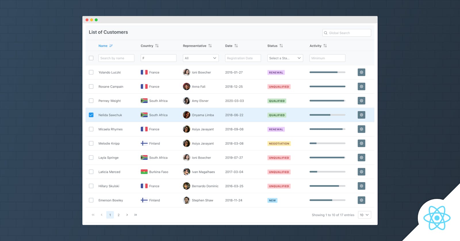
An optional global filter feature is available to search all fields with the same keyword, to implement this place an input component whose value is bound to the globalFilter property of the DataTable.
export const DataTableFilterDemo = () => {

    const [products, setProducts] = useState([]);
    const [globalFilter, setGlobalFilter] = useState(null);

    useEffect(() => {
        productService = new ProductService();
        productService.getProductsSmall().then(data => setProducts(data));
    } ,[])

    let header = (
        <div style={{'textAlign':'left'}}>
            <i className="pi pi-search" style={{margin:'4px 4px 0 0'}}></i>
            <InputText type="search" onInput={(e) => setGlobalFilter(e.target.value)} placeholder="Global Search" size="50"/>
        </div>
    );

    return (
        <DataTable value={products} paginator rows={10} header={header} globalFilter={globalFilter}>
            <Column field="code" header="Code" filter></Column>
            <Column field="name" header="Name" filter></Column>
            <Column field="category" header="Category" filter></Column>
            <Column field="quantity" header="Quantity" filter></Column>
        </DataTable>
    );
}
By default, input fields are used as filter elements and this can be customized using the filterElement property of the Column that calls the filter function of the table instance by passing the value, field and the match mode.
export const DataTableCustomFilterDemo = () => {

    const [products, setProducts] = useState([]);
    const [inventoryStatus, setInventoryStatus] = useState(null);
    const dt = useRef(null);

    useEffect(() => {
        productService = new ProductService();
        productService.getProductsSmall().then(data => setProducts(data));
    } ,[])

    const onStatusChange = (event) => {
        dt.current.filter(event.value, 'inventoryStatus', 'equals');
        setInventoryStatus(event.value);
    }

    let inventoryStatuses = [
            {label: 'All Status', value: null},
            {label: 'INSTOCK', value: 'INSTOCK'},
            {label: 'LOWSTOCK', value: 'LOWSTOCK'},
            {label: 'OUTOFSTOCK', value: 'OUTOFSTOCK'}
        ];

    let statusFilter = <Dropdown style={{width: '100%'}} className="ui-column-filter"
        value={inventoryStatus} options={inventoryStatuses} onChange={onStatusChange}/>

    return (
        <DataTable ref={dt} value={products}>
            <Column field="code" header="Code" filter></Column>
            <Column field="name" header="Name" filter></Column>
            <Column field="category" header="Category" filter></Column>
            <Column field="inventoryStatus" header="Status" filter filterElement="statusFilter"></Column>
        </DataTable>
    );
}
In case you'd like to display the table as filtered by default on mount, use filters property in Controlled or Uncontrolled manner. In controlled mode, filters and onFilter properties need to be defined to control the filtering state.
export const DataTableDefaultFilteredDemo = () => {

    const [products, setProducts] = useState([]);
    const [filters, setFilters] = useState({
        'inventoryStatus': {
            value: 'INSTOCK'
        });

    useEffect(() => {
        productService = new ProductService();
        productService.getProductsSmall().then(data => setProducts(data));
    } ,[])

    return (
        <DataTable value={products} filters={filters} onFilter={(e) => setFilters(e.filters)}>
            <Column field="code" header="Code" filter></Column>
            <Column field="name" header="Name" filter></Column>
            <Column field="category" header="Category" filter></Column>
            <Column field="inventoryStatus" header="Status" filter></Column>
        </DataTable>
    );
}
In uncontrolled filtering, no additional properties need to be enabled. Initial filtering can be still be provided using the filters property in uncontrolled mode however it is evaluated at initial rendering and ignored in further updates. If you programmatically need to update the filtering state, prefer to use the component as controlled.
<DataTable value={products}>
    <Column field="code" header="Code" filter></Column>
    <Column field="name" header="Name" filter></Column>
    <Column field="category" header="Category" filter></Column>
    <Column field="inventoryStatus" header="Status" filter></Column>
</DataTable>
Custom filtering is implemented by setting the filterMatchMode property as "custom" and providing a function that takes the data value along with the filter value to return a boolean.
export const DataTableFilterDemo = () => {

    const [products, setProducts] = useState([]);

    useEffect(() => {
        productService = new ProductService();
        productService.getProductsSmall().then(data => setProducts(data));
    }, [])

    const codeFilter = (value, filter) => {
        return filter > value;
    }

    return (
        <DataTable value={products}>
            <Column field="code" header="Code" filter filterMatchMode="custom" filterFunction={codeFilter}></Column>
            <Column field="name" header="Name" filter></Column>
            <Column field="category" header="Category" filter></Column>
            <Column field="inventoryStatus" header="Status" filter></Column>
        </DataTable>
    );
}
Getting access to the filtered data is provided by the onValueChange callback.
<DataTable value={products} onValueChange={filteredData => console.log(filteredData)}>
    <Column field="code" header="Code" filter></Column>
    <Column field="name" header="Name" filter></Column>
    <Column field="category" header="Category" filter></Column>
    <Column field="inventoryStatus" header="Status" filter></Column>
</DataTable>
Selection
DataTable provides single and multiple selection modes on click of a row. Selected rows are bound to the selection property for reading and updated using onSelectionChange callback. Alternatively column based selection can be done using radio buttons or checkboxes using selectionMode of a particular column. In addition onRowSelect - onRowUnselect events are provided as optional callbacks.
In single mode, selection binding is an object reference.
export const DataTableSelectionDemo = () => {

    const [products, setProducts] = useState([]);
    const [selectedProduct, setSelectedProduct] = useState(null);

    useEffect(() => {
        productService = new ProductService();
        productService.getProductsSmall().then(data => setProducts(data));
    }, [])

    return (
        <DataTable value={products} selectionMode="single"
            selection={selectedProduct} onSelectionChange={e => setSelectedProduct(e.value)}>
            <Column field="code" header="Code"></Column>
            <Column field="name" header="Name"></Column>
            <Column field="category" header="Category"></Column>
            <Column field="inventoryStatus" header="Status"></Column>
        </DataTable>
    );
}
In multiple mode, selection binding should be an array and multiple items can either be selected using metaKey or toggled individually depending on the value of metaKeySelection property value which is true by default. On touch enabled devices metaKeySelection is turned off automatically. Additionally ShiftKey is supported for range selection.
export const DataTableSelectionDemo = () => {

    const [products, setProducts] = useState([]);
    const [selectedProducts, setSelectedProducts] = useState(null);

    useEffect(() => {
        productService = new ProductService();
        productService.getProductsSmall().then(data => setProducts(data));
    }, []);

    return (
        <DataTable value={products} selectionMode="multiple"
            selection={selectedProducts} onSelectionChange={e => setSelectedProducts(e.value)}>
            <Column field="code" header="Code"></Column>
            <Column field="name" header="Name"></Column>
            <Column field="category" header="Category"></Column>
            <Column field="inventoryStatus" header="Status"></Column>
        </DataTable>
    );

}
If you prefer a radioButton or a checkbox instead of a row click, use the selectionMode of a column instead. Following datatable displays a checkbox at the first column of each row and automatically adds a header checkbox to toggle selection of all rows.
Tip: Use showSelectionElement function in case you need to hide selection element for a particular row.
<DataTable value={products} selection={selectedProducts} onSelectionChange={e => setSelectedProducts(e.value))}>
    <Column selectionMode="multiple" />
    <Column field="code" header="Code"></Column>
    <Column field="name" header="Name"></Column>
    <Column field="category" header="Category"></Column>
    <Column field="inventoryStatus" header="Status"></Column>
</DataTable>
Cell Editing
Incell editing feature provides a way to quickly edit data inside the table. A cell editor is defined using the editor property that refers to a function to return an input element for the editing.
<DataTable value={products}>
    <Column field="code" header="Code" editor={codeEditor}></Column>
    <Column field="name" header="Name" editor={nameEditor}></Column>
    <Column field="inventoryStatus" header="Status" body={statusBodyTemplate} editor={statusEditor}></Column>
    <Column field="price" header="Price" editor={priceEditor}></Column>
</DataTable>
const onEditorValueChange = (props, value) => {
    let updatedProducts = [...props.value];
    updatedProducts[props.rowIndex][props.field] = value;
    setProducts(updatedProducts);
}

const inputTextEditor = (props, field) => {
    return <InputText type="text" value={props.rowData[field]} onChange={(e) => onEditorValueChange(props, e.target.value)} />;
}

const codeEditor = (props) => {
    return inputTextEditor(props, 'code');
}

const nameEditor = (props) => {
    return inputTextEditor(props, 'name');
}

const priceEditor = (props) => {
    return inputTextEditor(props, 'price');
}

const statusEditor = (props) => {
    return (
        <Dropdown value={props.rowData['inventoryStatus']} options={statuses} optionLabel="label" optionValue="value"
            onChange={(e) => onEditorValueChange(props, e.value)} style={{ width: '100%' }} placeholder="Select a Status"
            itemTemplate={(option) => {
                return <span className={`product-badge status-${option.value.toLowerCase()}`}>{option.label}</span>
            }} />
    );
}
Clicking outside the cell or hitting enter key closes the cell, however this may not be desirable if the input is invalid. In order to decide whether to keep the cell open or not, provide a editorValidator function that validates the value. Optionally onEditorSubmit and onEditorCancel events are available at the column component to provide callbacks whenever an editor is submitted or cancelled.
<DataTable value={products}>
    <Column field="code" header="Code" editor={codeEditor} editorValidator={requiredValidator} />
    <Column field="name" header="Name" editor={nameEditor} />
    <Column field="price" header="Price" editor={priceDateEditor} />
</DataTable>
const requiredValidator = (e) => {
    let props = e.columnProps;
    let value = props.rowData[props.field];
    return value && value.length > 0;
}
Row Editing
Row editing toggles the visibility of the all editors in the row at once and provides additional options to save and cancel editing.
<DataTable value={products} editMode="row">
    <Column field="code" header="Code" />
    <Column field="name" header="Name" />
    <Column field="inventoryStatuses" header="Status" editor={statusEditor} onRowEditorValidator={onRowEditorValidator} />
    <Column rowEditor />
</DataTable>
const onRowEditorValidator = (rowData) => {
    let value = rowData['inventoryStatuses'];
    return value.length > 0;
}
ContextMenu
DataTable provides exclusive integration with ContextMenu. contextMenuSelection and onContextMenuSelectionChange are used to get a reference of the the selected row and onContextMenu callback is utilized to display a particular context menu.
export const DataTableContextMenuDemo = () => {

    const [products, setProducts] = useState([]);
    const [selectedProduct, setSelectedProduct] = useState(null);
    const toast = useRef(null);
    const cm = useRef(null);

    const menuModel = [
        {label: 'View', icon: 'pi pi-fw pi-search', command: () => viewProduct(selectedProduct)},
        {label: 'Delete', icon: 'pi pi-fw pi-times', command: () => deleteProduct(selectedProduct)}
    ];

    useEffect(() => {
        productService = new ProductService();
        productService.getProductsSmall().then(data => setProducts(data));
    }, [])

    const viewProduct = (product) => {
        toast.current.show({severity: 'info', summary: 'Product Selected', detail: product.name});
    }

    const deleteProduct = (product) => {
        let products = [...products];
        products = products.filter((p) => p.id !== product.id);
        toast.current.show({severity: 'info', summary: 'Product Deleted', detail: product.name});
        setProducts(products);
    }

    const formatCurrency = (value) => {
        return value.toLocaleString('en-US', {style: 'currency', currency: 'USD'});
    }

    const priceBodyTemplate = (rowData) => {
        return formatCurrency(rowData.price);
    }

    return (
        <div>
            <Toast ref={toast}></Toast>

            <ContextMenu model={menuModel} ref={cm} onHide={() => setSelectedProduct(null)}/>

            <DataTable value={products} contextMenuSelection={selectedProduct}
                onContextMenuSelectionChange={e => setSelectedProduct(e.value)}
                onContextMenu={e => cm.current.show(e.originalEvent)}>
                <Column field="code" header="Code"></Column>
                <Column field="name" header="Name"></Column>
                <Column field="category" header="Category"></Column>
                <Column field="price" header="Price" body={priceBodyTemplate} />
            </DataTable>
        </div>
    );
}
Expandable Rows
Row expansion allows displaying detailed content for a particular row. To use this feature, add an expander column, define a rowExpansionTemplate as a function to return the expanded content and bind to expandedRows property to read the expanded rows along with the onRowToggle property to update it. expandedRows property either accepts an array of row data or a map whose key is the dataKey of the record. Using expandable rows with a dataKey is suggested for better performance.
export const DataTableRowExpansionDemo = () => {

    const [products, setProducts] = useState([]);
    const [expandedRows, setExpandedRows] = useState(null);

    useEffect(() => {
        productService = new ProductService();
        productService.getProductsWithOrdersSmall().then(data => setProducts(data));
    }, [])

    const onRowExpand = (event) => {
        toast.current.show({severity: 'info', summary: 'Product Expanded', detail: event.data.name, life: 3000});
    }

    const onRowCollapse = (event) => {
        toast.current.show({severity: 'success', summary: 'Product Collapsed', detail: event.data.name, life: 3000});
    }

    const expandAll = () => {
        let _expandedRows = {};
        products.forEach(p => expandedRows[`${p.id}`] = true);

        setExpandedRows(_expandedRows);
    }

    const collapseAll = () => {
        setExpandedRows(null);
    }

    const formatCurrency = (value) => {
        return value.toLocaleString('en-US', {style: 'currency', currency: 'USD'});
    }

    const amountBodyTemplate = (rowData) => {
        return formatCurrency(rowData.amount);
    }

    const statusOrderBodyTemplate = (rowData) => {
        return <span className={`order-badge order-${rowData.status.toLowerCase()}`}>{rowData.status}</span>;
    }

    const searchBodyTemplate = () => {
        return <Button icon="pi pi-search" />;
    }

    const imageBodyTemplate = (rowData) => {
        return <img src={`showcase/demo/images/product/${rowData.image}`} alt={rowData.image} className="product-image" />;
    }

    const priceBodyTemplate = (rowData) => {
        return formatCurrency(rowData.price);
    }

    const ratingBodyTemplate = (rowData) => {
        return <Rating value={rowData.rating} readonly cancel={false} />;
    }

    const statusBodyTemplate = (rowData) => {
        return <span className={`product-badge status-${rowData.inventoryStatus.toLowerCase()}`}>{rowData.inventoryStatus}</span>;
    }

    const rowExpansionTemplate = (data) => {
        return (
            <div className="orders-subtable">
                <h5>Orders for {data.name}</h5>
                <DataTable value={data.orders}>
                    <Column field="id" header="Id" sortable></Column>
                    <Column field="customer" header="Customer" sortable></Column>
                    <Column field="date" header="Date" sortable></Column>
                    <Column field="amount" header="Amount" body={amountBodyTemplate} sortable></Column>
                    <Column field="status" header="Status" body={statusOrderBodyTemplate} sortable></Column>
                    <Column headerStyle={{ width: '4rem'}} body={searchBodyTemplate}></Column>
                </DataTable>
            </div>
        );
    }

    const header = (
        <div className="table-header-container">
            <Button icon="pi pi-plus" label="Expand All" onClick={expandAll} className="p-mr-2" />
            <Button icon="pi pi-minus" label="Collapse All" onClick={collapseAll} />
        </div>
    );

    return (
        <DataTable value={products} expandedRows={expandedRows} onRowToggle={(e) => setExpandedRows(e.data)}
            onRowExpand={onRowExpand} onRowCollapse={onRowCollapse}
            rowExpansionTemplate={rowExpansionTemplate} dataKey="id" header={header}>
            <Column expander style={{ width: '3em' }} />
            <Column field="name" header="Name" sortable />
            <Column header="Image" body={imageBodyTemplate} />
            <Column field="price" header="Price" sortable body={priceBodyTemplate} />
            <Column field="category" header="Category" sortable />
            <Column field="rating" header="Reviews" sortable body={ratingBodyTemplate} />
            <Column field="inventoryStatus" header="Status" sortable body={statusBodyTemplate} />
        </DataTable>
    );
}
Column Resize
Columns can be resized using drag drop by setting the resizableColumns to true. There are two resize modes; "fit" and "expand". Fit is the default one and the overall table width does not change when a column is resized. In "expand" mode, table width also changes along with the column width. onColumnResizeEnd is a callback that passes the resized column header as a parameter.
<DataTable value={products} resizableColumns>
    <Column field="code" header="Code"></Column>
    <Column field="name" header="Name"></Column>
    <Column field="category" header="Category"></Column>
    <Column field="quantity" header="Quantity"></Column>
</DataTable>
It is important to note that when you need to change column widths, since table width is 100%, giving fixed pixel widths does not work well as browsers scale them, instead give percentage widths.
<DataTable value={products} resizableColumns>
    <Column field="code" header="Code" style={{width:'20%'}}></Column>
    <Column field="name" header="Name" style={{width:'40%'}}></Column>
    <Column field="category" header="Category" style={{width:'20%'}}></Column>
    <Column field="quantity" header="Quantity" style={{width:'30%'}}></Column>
</DataTable>
Column Reorder
Columns can be reordered using drag drop by setting the reorderableColumns to true. onColReorder is a callback that is invoked when a column is reordered. DataTable keeps the column order state internally using keys that identifies a column using the field property. If the column has no field, use columnKey instead.
<DataTable value={products} reorderableColumns>
    <Column field="code" header="Code"></Column>
    <Column field="name" header="Name"></Column>
    <Column field="category" header="Category"></Column>
    <Column field="quantity" header="Quantity"></Column>
</DataTable>
Row Reorder
Data can be reordered using drag drop by adding a reorder column that will display an icon as a drag handle. onRowReorder is a callback that is invoked when a column is reordered, use this callback to update the new order. The reorder icon can be customized using rowReorderIcon of the column component.
Tip: Use showRowReorderElement function in case you need to hide selection element for a particular row.
<DataTable value={products} reorderableColumns onRowReorder={(e) => setProducts(e.value)}>
    <Column rowReorder style={{width: '2em'}} />
    <Column columnKey="code" field="code" header="Code"></Column>
    <Column columnKey="name" field="name" header="Name"></Column>
    <Column columnKey="category" field="category" header="Category"></Column>
    <Column columnKey="quantity" field="quantity" header="Quantity"></Column>
</DataTable>
Data Export
DataTable can export its data in CSV format using exportCSV() method.
export const DataTableExportDemo = () => {

    const [products, setProducts] = useState([]);
    const dt = useRef(null);

    useEffect(() => {
        productService = new ProductService();
        productService.getProductsSmall().then(data => setProducts(data));
    }, [])

    const export = () => {
        dt.exportCSV();
    }

    const header = <div style={{textAlign:'left'}}><Button type="button" icon="pi pi-external-link" iconPos="left" label="CSV" onClick={export}></Button></div>;

    return (
        <DataTable value={products} header={header} ref={dt}>
            <Column field="code" header="Code"></Column>
            <Column field="name" header="Name"></Column>
            <Column field="category" header="Category"></Column>
            <Column field="quantity" header="Quantity"></Column>
        </DataTable>
    );
}
RowGrouping
RowGrouping has two modes defined be the rowGroupMode property, in "subheader" option rows are grouped by a groupField and in "rowspan" mode grouping is done based on the sort field. In both cases, data should be sorted initally using the properties such as sortField and sortOrder. In "subheader" mode,rowGroupHeaderTemplate property should be defined to provide the content of the header and optionally rowGroupFooterTemplate is available to provide a footer for the group.
const DataTableRowGroupDemo = () => {

    const [products, setProducts] = useState(null);

    useEffect(() => {
        productService = new ProductService();
        productService.getProductsSmall().then(data => setProducts(data));
    }, []);

    const headerTemplate = (data) => {
        return data.name;
    }

    const footerTemplate = (data, index) => {
        return ([
                    <td key={data.brand + '_footerTotalLabel'} colSpan="3" style={{textAlign: 'right'}}>Total Price</td>,
                    <td key={data.brand + '_footerTotalValue'}>{calculateGroupTotal(data.name)}</td>
                ]
        );
    }

    const calculateGroupTotal = (name) => {
        let total = 0;

        if (products) {
            for (let product of products) {
                if (product.name === name) {
                    total += product.price;
                }
            }
        }

        return total;
    }

    return (
        <div>
            <DataTable header="SubHeader" value={products} rowGroupMode="subheader" sortField="brand" sortOrder={1} groupField="name"
                rowGroupHeaderTemplate={headerTemplate} rowGroupFooterTemplate={footerTemplate}>
                <Column field="code" header="Code"></Column>
                <Column field="name" header="Name"></Column>
                <Column field="category" header="Category"></Column>
                <Column field="price" header="Price"></Column>
            </DataTable>

            <DataTable header="RowSpan" value={products} rowGroupMode="rowspan" sortField="brand" sortOrder={1} groupField="name"
                style={{marginTop:'30px'}}>
                <Column field="code" header="Code"></Column>
                <Column field="name" header="Name"></Column>
                <Column field="category" header="Category"></Column>
                <Column field="price" header="Price"></Column>
            </DataTable>
        </div>
    );

}
Scrolling
DataTable supports both horizontal and vertical scrolling as well as frozen columns and rows. Scrollable DataTable is enabled using scrollable property and scrollHeight to define the viewport height.
<DataTable value={products} scrollable scrollHeight="200px">
    <Column field="code" header="Code"></Column>
    <Column field="name" header="Name"></Column>
    <Column field="category" header="Category"></Column>
    <Column field="quantity" header="Quantity"></Column>
</DataTable>
Horizontal Scrolling requires a width of DataTable to be defined and explicit widths on columns.
<DataTable value={products} scrollable scrollHeight="200px" style={{width: '600px'}}>
    <Column field="code" header="Code" style={{width:'250px'}}></Column>
    <Column field="name" header="Name" style={{width:'250px'}}></Column>
    <Column field="category" header="Category" style={{width:'250px'}}></Column>
    <Column field="quantity" header="Quantity" style={{width:'250px'}}></Column>
</DataTable>
Certain columns can be frozen by using the frozen property of the column component. Widths of the frozen section is specified by the frozenWidth property.
<DataTable value={products} scrollable scrollHeight="200px" style={{width: '800px'}} frozenWidth="200px">
    <Column field="code" header="Code" style={{width:'250px'}} frozen></Column>
    <Column field="name" header="Name" style={{width:'250px'}}></Column>
    <Column field="category" header="Category" style={{width:'250px'}}></Column>
    <Column field="quantity" header="Quantity" style={{width:'250px'}}></Column>
    <Column field="price" header="Price" style={{width:'250px'}}></Column>
    <Column field="rating" header="Rating" style={{width:'250px'}}></Column>
    <Column field="description" header="Description" style={{width:'250px'}}></Column>
    <Column field="inventoryStatus" header="Status" style={{width:'250px'}}></Column>
</DataTable>
Note that frozen columns are enabled, frozen and scrollable cells may have content with varying height which leads to misalignment. Provide fixed height to cells to avoid alignment issues.
<DataTable value={products} scrollable scrollHeight="200px" style={{width: '800px'}} frozenWidth="200px">
    <Column field="code" header="Code" style={{width:'250px', height: '25px'}} frozen></Column>
    <Column field="name" header="Name" style={{width:'250px', height: '25px'}}></Column>
    <Column field="category" header="Category" style={{width:'250px', height: '25px'}}></Column>
    <Column field="quantity" header="Quantity" style={{width:'250px', height: '25px'}}></Column>
</DataTable>
One or more rows can be displayed as fixed using the frozenValue property.
<DataTable header="Frozen Rows" value={products} frozenValue={frozenProducts} scrollable scrollHeight="200px" style={{marginTop:'30px'}}>
    <Column field="code" header="Code"></Column>
    <Column field="name" header="Name"></Column>
    <Column field="category" header="Category"></Column>
    <Column field="quantity" header="Quantity"></Column>
</DataTable>
When using frozen columns with column grouping, use frozenHeaderColumnGroup and frozenFooterColumnGroup properties along withheaderColumnGroup and footerColumnGroup.
Virtual scrolling is enabled using virtualScroll and onVirtualScroll properties combined with lazy loading so that data is loaded on the fly during scrolling. For smooth scrolling twice the amount of rows property is loaded on a lazy load event. In addition, to avoid performance problems row height is not calculated automatically and should be provided using virtualRowHeight property which defaults to 28px. View the scrolling demo for a sample implementation.
<DataTable value={lazyProducts} scrollable scrollHeight="200px" virtualScroll
    rows={10} totalRecords={lazyTotalRecords} lazy onVirtualScroll={loadProductsLazy} style={{marginTop:'30px'}}>
    <Column field="code" header="Code"></Column>
    <Column field="name" header="Name"></Column>
    <Column field="category" header="Category"></Column>
    <Column field="quantity" header="Quantity"></Column>
</DataTable>
Lazy Loading
Lazy mode is handy to deal with large datasets, instead of loading the entire data, small chunks of data is loaded by invoking corresponding callbacks everytime paging, sorting and filtering happens. Sample belows imitates lazy paging by using an in memory list. It is also important to assign the logical number of rows to totalRecords by doing a projection query for paginator configuration so that paginator displays the UI assuming there are actually records of totalRecords size although in reality they aren't as in lazy mode, only the records that are displayed on the current page exist.
In lazy mode, pagination, sorting and filtering must be used in controlled mode in addition to enabling lazy property. Here is a sample paging implementation with in memory data.
export const DataTableLazyDemo = () => {

    const [products, setProducts] = useState([]);
    const [loading, setLoading] = useState(true);
    const [first, setFirst] = useState(0);
    const [rows, setRows] = useState(10);
    const [totalRecords, setTotalRecords] = useState(0);
    const [dataSource, setDataSource] = useState([]);

    useEffect((() => {
        productService = new ProductService();
        productService.getProducts().then(data => {
            setDataSource(data);
            setTotalRecords(data.length);
            setProducts(datasource.slice(0, rows));
            setLoading(false);
        });
    }, []);

    const onPage = (event) => {
        setLoading(true);

        //imitate delay of a backend call
        setTimeout(() => {
            const startIndex = event.first;
            const endIndex = event.first + rows;

            setFirst(startIndex);
            setProducts(datasource.slice(startIndex, endIndex));
            setLoading(false);
        }, 250);
    }

    return (
        <DataTable value={products} paginator rows={rows} totalRecords={totalRecords}
            lazy first={first} onPage={onPage} loading={loading}>
            <Column field="code" header="Code"></Column>
            <Column field="name" header="Name"></Column>
            <Column field="category" header="Category"></Column>
            <Column field="quantity" header="Quantity"></Column>
        </DataTable>
    )
}
TableState
Stateful table allows keeping the state such as page, sort and filtering either at local storage or session storage so that when the page is visited again, table would render the data using its last settings. Enabling state is easy as defining a unique stateKey, the storage to keep the state is defined with the stateStorage property that accepts session for sessionStorage and local for localStorage. Also, a special storage implementation can be made with customSaveState and customRestoreState methods using stateStorage="custom". Currently following features are supported by TableState; paging, sorting, filtering, column resizing, column reordering, row expansion and row selection.
export const DataTableStateDemo = () => {

    const [products, setProducts] = useState([]);
    const [selectedProducts, setSelectedProducts] = useState(null);

    useEffect(() => {
        productService = new ProductService();
        productService.getProductsSmall().then(data => setProducts(data));
    }, [])

    return (
        <DataTable value={products} selectionMode="multiple" resizableColumns
                    selection={selectedProducts} onSelectionChange={e => setSelectedProducts(e.value)}
                    paginator rows={10} stateKey="tablestatedemo-session">
            <Column field="code" header="Code" sortable filter></Column>
            <Column field="name" header="Name" sortable filter></Column>
            <Column field="category" header="Category" sortable filter></Column>
            <Column field="quantity" header="Quantity" sortable filter></Column>
        </DataTable>
    );
}
Responsive
DataTable display can be optimized according to screen sizes, this example demonstrates a sample demo where columns are stacked on small screens.
<DataTable value={products} className="p-datatable-responsive-demo">
    <Column field="code" header="Code" body={bodyTemplate}></Column>
    <Column field="name" header="Name" body={bodyTemplate}></Column>
    <Column field="category" header="Category" body={bodyTemplate}></Column>
    <Column field="quantity" header="Quantity" body={bodyTemplate}></Column>
</DataTable>
const bodyTemplate = (data, props) => {
    return (
        <React.Fragment>
            <span className="p-column-title">{props.header}</span>
            {data[props.field]}
        </React.Fragment>
    );
}
.p-datatable-responsive-demo .p-datatable-tbody > tr > td .p-column-title {
    display: none;
}

@media screen and (max-width: 40em) {
    .p-datatable {
        &.p-datatable-responsive-demo {
            .p-datatable-thead > tr > th,
            .p-datatable-tfoot > tr > td {
                display: none !important;
            }

            .p-datatable-tbody > tr > td {
                text-align: left;
                display: block;
                border: 0 none !important;
                width: 100% !important;
                float: left;
                clear: left;

                .p-column-title {
                    padding: .4rem;
                    min-width: 30%;
                    display: inline-block;
                    margin: -.4em 1em -.4em -.4rem;
                    font-weight: bold;
                }
            }
        }
    }
}
Theming
DataTable supports various themes featuring Material, Bootstrap, Fluent as well as your own custom themes via the Designer tool.
Resources
Visit the PrimeReact DataTable showcase for demos and documentation.