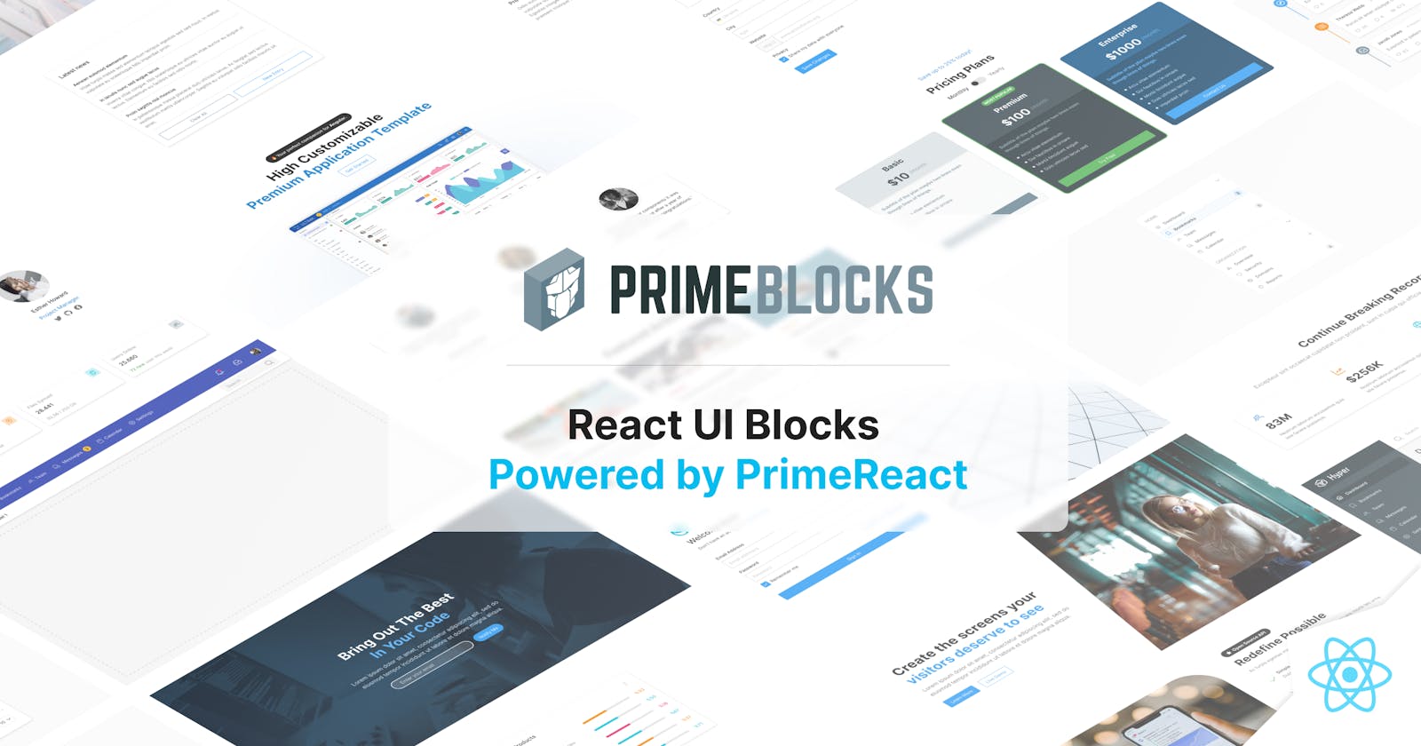


PrimeBlocks is a new project from PrimeTek featuring copy-paste-ready, easy-to-use building UI blocks based on PrimeFlex CSS utility library. It is available for all four Prime UI libraries and version v2 is out now for PrimeReact featuring 130+ new blocks making 280+ in total.
Compatibility
PrimeBlocks library requires PrimeReact 6.5.1+ coupled with PrimeFlex 3.1.0+.
What is a Block?
A UI block is a set of html elements styled with the PrimeFlex CSS utility library. A block can also contain PrimeReact components in addition to regular elements. The blocks are designed to be used easily by simply moving the block code to your own application. This is achieved by defining the styling in the markup without using a custom css declaration. In cases where a block requires interactivity such as toggling the visibility of a menu or a sidebar, StyleClass component of PrimeReact manages the events and animations.
What can be done with Blocks?
Blocks are meant to be used together to build landing pages, dashboards or any other content you can imagine.
Theming
Blocks utilize color classes for background, text color, border color and pseudo-states. Color values are derived from the PrimeReact theme being used so that a block can seamlessly integrate with your application. For example, bg-blue-500 class retrieves the background color using the –blue-500 CSS variables from PrimeReact. See PrimeReact colors palettes for more information.
Pricing
Whether you are an individual or a member of a team, PrimeBlocks are available for affordable prices. Please visit the pricing page for details.
Roadmap
The next step is updating the PrimeBlocks of PrimeFaces to v2 and then beginning to work on v3 that focuses on the brand new e-commerce blocks.