

Today we’re excited to announce PrimeReact version 6.6.0 that brings many improvements including the Tailwind theme, Image Preview component, Scrollable Tabs and more.
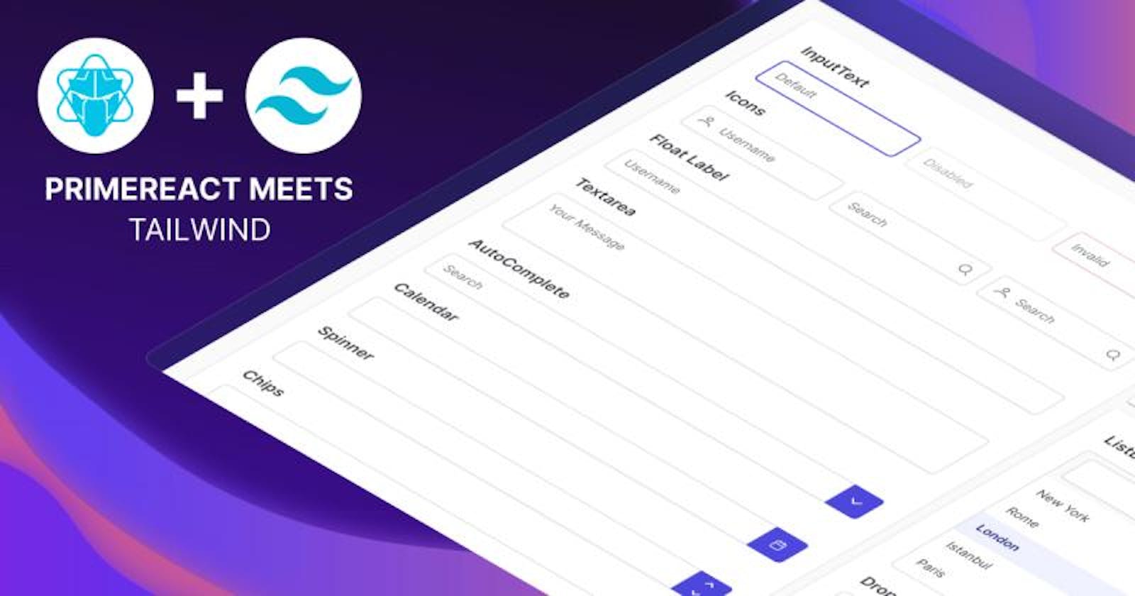
Tailwind Theme
The new theme uses the official color palette from Tailwind and is based on the design bits at Tailwind UI such as forms, modals and menus. If you are utilizing tailwind ui and looking for a fully-featured UI component library, PrimeReact with the Tailwind theme will be an excellent choice. Note that, the theme does not use tailwind classes and instead provides a look-alike style for a unified design when used together.
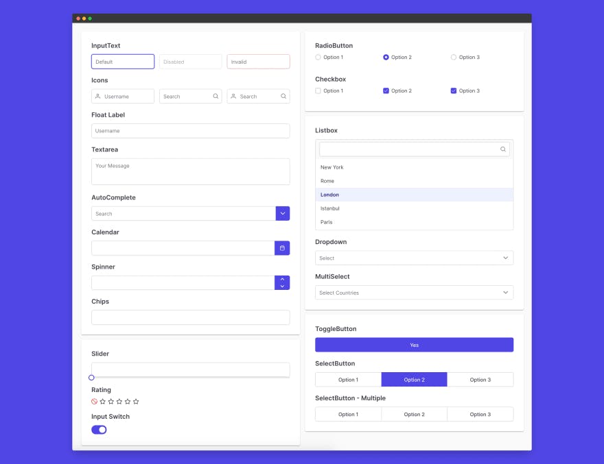
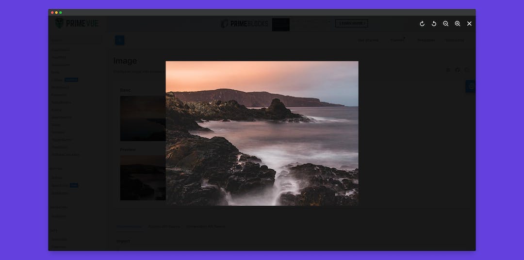
Image Preview
Image is a new addition to the UI suite to display an image with transformation options like rotate and zoom. For multiple images, please see the Galleria.
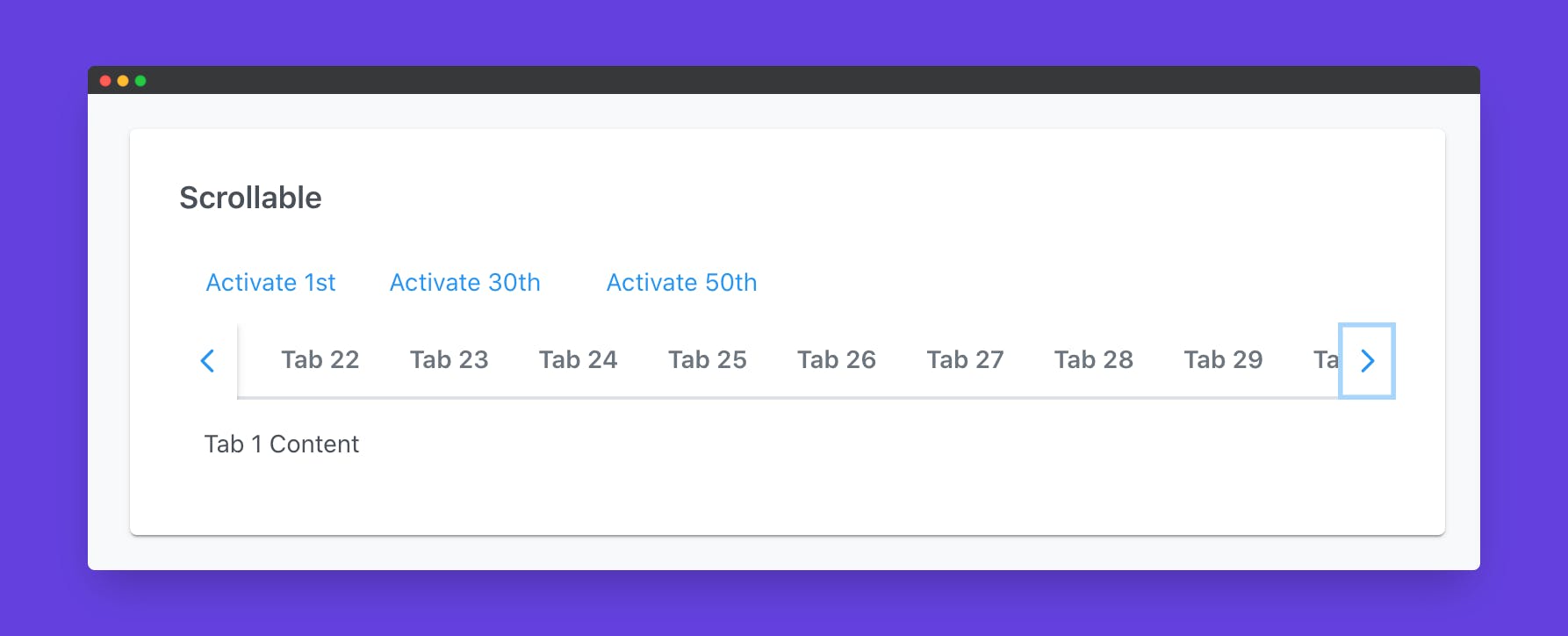
Scrollable Tabs
Scrollable tabs display buttons at each side of the tab view header to effectively render many tabs at once without wrapping. On mobile devices, touch support is also enabled.
Changelog
There are over 35 improvements in this release, defect fixes are mostly based on community feedback so thank you for helping us to make the library better.
Download
PrimeReact is licensed under MIT and free to download at NPM.
Roadmap
Our current focus is on improving accessibility by creating a dedicated section per component for keyboard support and screen readers along with scores from audit tools. In addition, DataTable will receive a major overhaul to introduce new advanced filtering and scrolling that is already available in PrimeNG and PrimeVue.