How to Switch Your Angular App Between Material, Bootstrap and Custom Themes at Runtime


UI Component libraries usually depend on a certain style such as material, bootstrap, bulma and others. One of the most powerful features of PrimeNG is being design agnostic so that you can switch between material, bootstrap, fluentui, primeone themes and your very own themes easily without having to rewrite your app with another library. Read more about PrimeNG Theming for technical details.
A certain theme can be bundled within an app by importing the css to the bundle easily but how to do it dynamically at runtime. Luckily Angular CLI has built-in options to implement this so that your users can switch it on-the-fly. Implementation consists of two parts, creating a theme css to lazy load and importing it to your page.
Watch the Tutorial on Youtube
Create Theme Files
We need to create a file that imports the theme from node_modules and configure CLI to move it to the dist folder for deployment. First create a separate file to import a theme, examples below are a light material theme and a dark bootstrap theme. There are over 30 Themes to choose from with the option of premium themes and your own themes via the Theme Designer.
src/theme-md-light-indigo.scss
@import "primeng/resources/themes/md-light-indigo/theme.css";
src/theme-bootstrap-4-dark-purple.scss
@import "primeng/resources/themes/bootstrap4-dark-purple/theme.css";
Next step is configuring Angular CLI to build them as separate css files.
"styles": [
    "src/styles.scss",
    {
        "input": "src/theme-md-light-indigo.scss",
        "bundleName": "md-light-indigo",
        "inject": false
    },
    {
    "input": "src/theme-bootstrap4-dark-purple.scss",
    "bundleName": "bootstrap4-dark-purple",
    "inject": false
    }
],
When you run ng build, the dist folder will have md-light-indigo.css and bootstrap4-dark-purple.css files. Let's move to the next part to include these dynamically.
Dynamic Imports
Let's assume the application uses the material theme by default using a link tag.
<!doctype html>
<html lang="en">
<head>
  <meta charset="utf-8">
  <title>NgBlocks</title>
  <base href="/">
  <meta name="viewport" content="width=device-width, initial-scale=1">
  <link rel="icon" type="image/x-icon" href="favicon.ico">
  <link id="app-theme" rel="stylesheet" type="text/css" href="md-light-indigo.css">
</head>
<body>
  <app-root></app-root>
</body>
</html>
An injectible theme service would be handy to change the theme at runtime by changing the path of the link element.
import { Inject, Injectable } from '@angular/core';
import { DOCUMENT } from '@angular/common';

@Injectable({
    providedIn: 'root',
})
export class ThemeService {

    constructor(@Inject(DOCUMENT) private document: Document) {}

    switchTheme(theme: string) {
        let themeLink = this.document.getElementById('app-theme') as HTMLLinkElement;

        if (themeLink) {
            themeLink.href = theme + '.css';
        }
    }
}
The app.component gets the theme service and offers an event to change the theme.
import { Inject, Injectable } from '@angular/core';
import { DOCUMENT } from '@angular/common';

@Injectable({
    providedIn: 'root',
})
export class ThemeService {

    constructor(@Inject(DOCUMENT) private document: Document) {}

    switchTheme(theme: string) {
        let themeLink = this.document.getElementById('app-theme') as HTMLLinkElement;

        if (themeLink) {
            themeLink.href = theme + '.css';
        }
    }
}
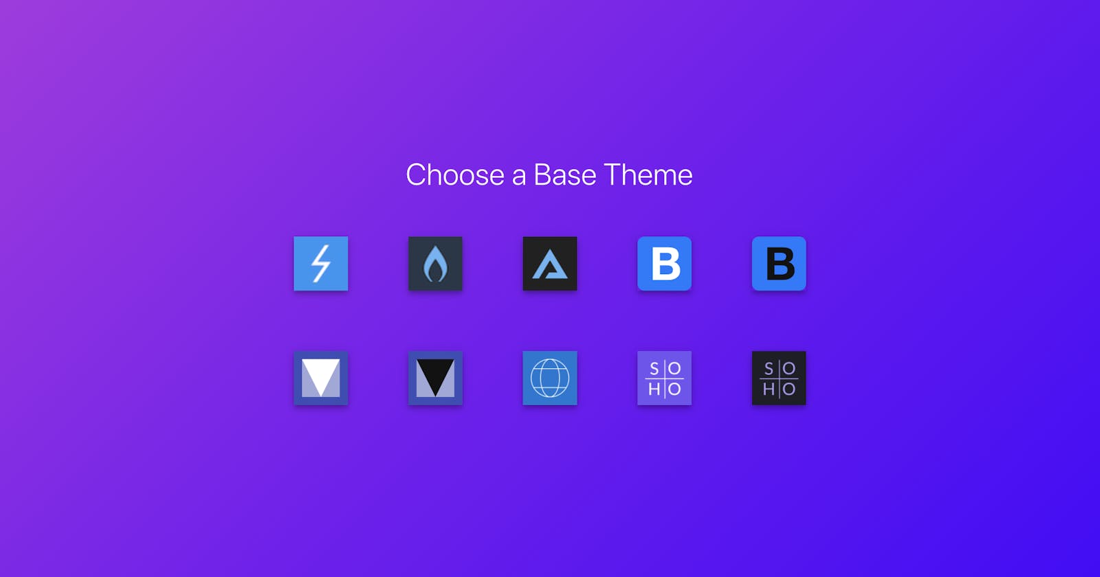
Finally, we need a UI to change a theme such as the following.
    <div class="flex align-items-center">
        <a (click)="changeTheme('md-light-indigo')" class="mr-3 cursor-pointer">
            <img src="assets/images/themes/md-light-indigo.svg" width="50">
        </a>
        <a (click)="changeTheme('bootstrap4-dark-purple')" class="mr-3 cursor-pointer">
            <img src="assets/images/themes/bootstrap4-dark-purple.svg" width="50">
        </a>
    </div>
That's it, with PrimeNG there is no need to rewrite your entire app with a new library just to change themes. This sample can even be extended to show how to keep the user preferred theme at a database or local storage and load it while app is being initialized after login. Another use case might be switching to dark mode automatically when app is being accessed at night. Possibilities are endless.