

Angular ToggleButton is used to select a boolean value using a button.
Setup
Refer to PrimeNG setup documentation for download and installation steps for your environment.
Import
import {ToggleButtonModule} from 'primeng/togglebutton';
Getting Started
Two-way binding to a boolean property is defined using the standard ngModel directive.
<p-toggleButton [(ngModel)]="checked"></p-toggleButton>
export class ModelComponent {

    checked: boolean;

}
As model is two-way binding enabled, setting the bound value as true displays the state as checked.
export class ModelComponent {

   checked: boolean = true;

}
Model Driven Forms
ToggleButton can be used in a model driven form as well.
<p-toggleButton formControlName="agreed"></p-toggleButton>
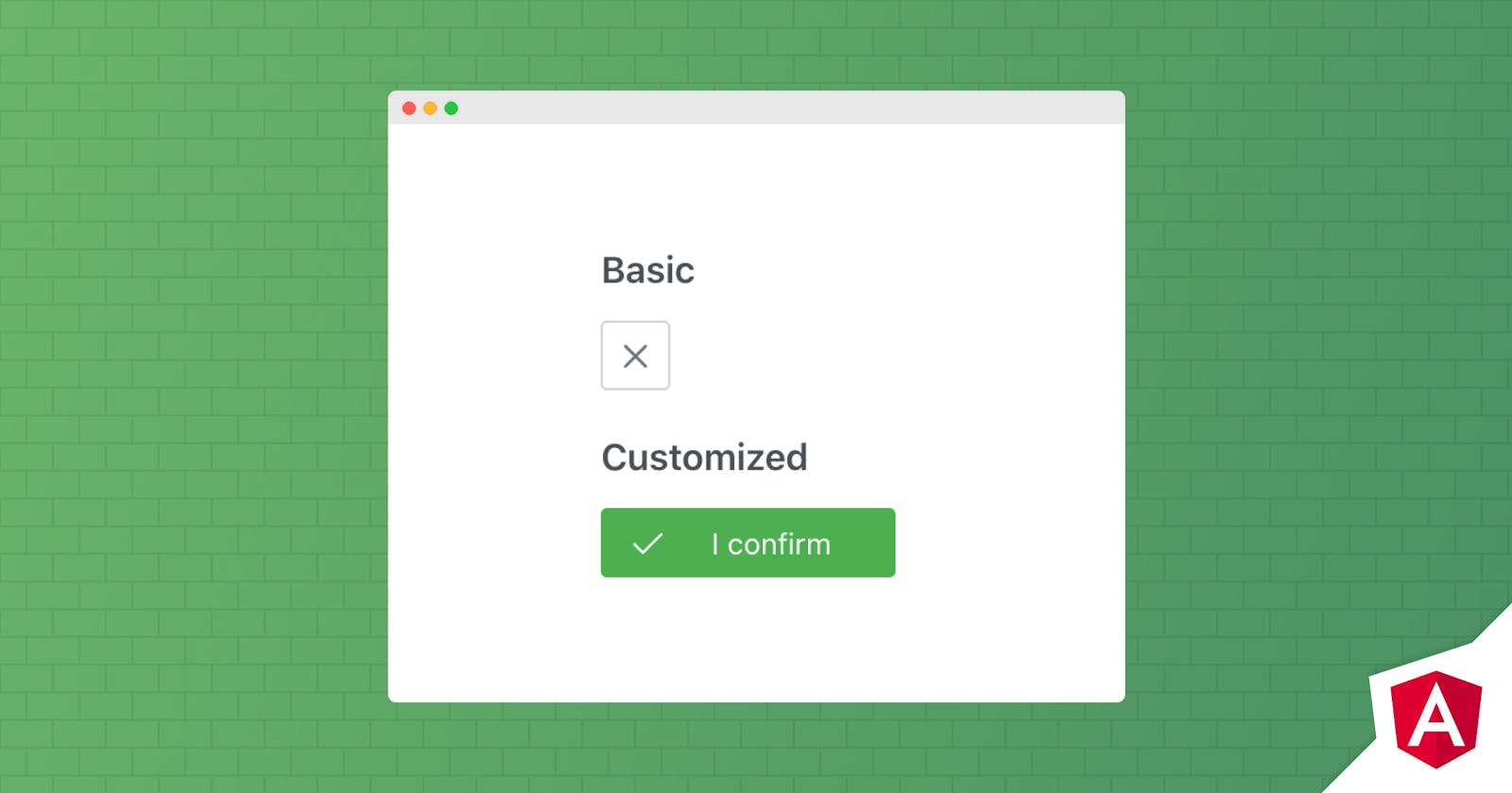
Labels
Labels are customized using onLabel and offLabel properties.
<p-toggleButton onLabel="I confirm" offLabel="I reject"
            onIcon="pi pi-check" offIcon="pi pi-times" [(ngModel)]="val"></p-toggleButton>
Icons
Icon on a ToggleButton is specified with the onIcon and offIcon properties and position is customized using the iconPos property.
<p-toggleButton onLabel="I confirm" offLabel="I reject"
            onIcon="pi pi-check" offIcon="pi pi-times" iconPos="right" [(ngModel)]="val"></p-toggleButton>
Theming
ToggleButton supports various themes featuring Material, Bootstrap, Fluent as well as your own custom themes via the Designer tool.
Resources
Visit the PrimeNG ToggleButton showcase for demos and documentation.