

Angular Button is an extension to standard button element with icons and theming.
Setup
Refer to PrimeNG setup documentation for download and installation steps for your environment.
Import
import {ButtonModule} from 'primeng/button';
Getting Started
Button is either applies as a component using p-button element or a directive using pButton attribute. Directive enhances an existing button whereas p-button is an element on its own.
<button pButton type="button" label="Click" ></button>
<p-button label="Click" ></p-button>
Label
Text of the button is defined using the label property.
<button pButton type="button" label="Click" ></button>
<p-button label="Click" ></p-button>
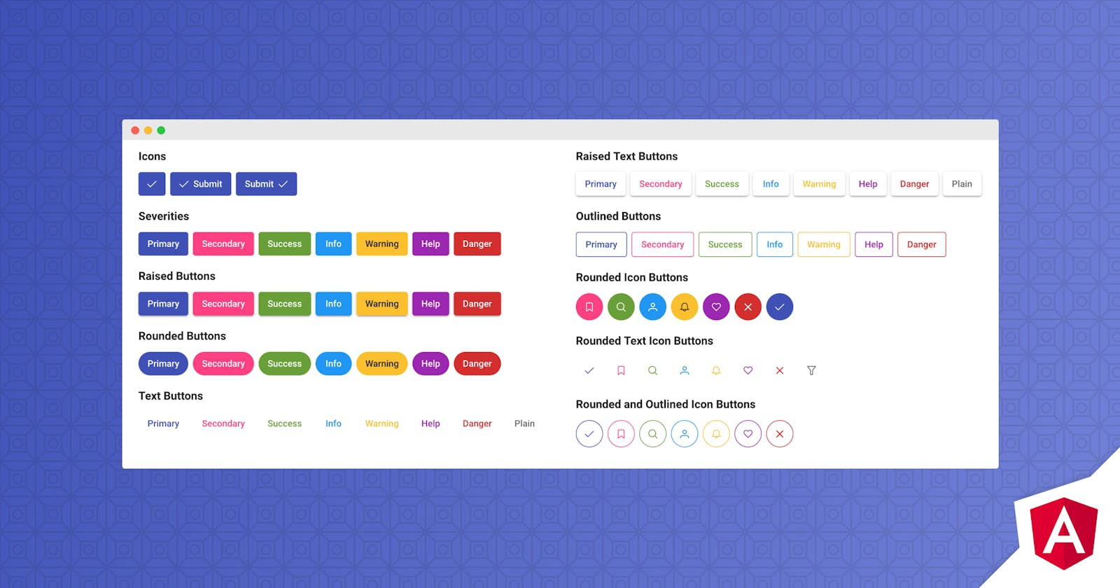
Icons
Icon on a button is specified with icon attribute and position is customized using iconPos attribute. Default icon position is left. To display only an icon, leave label as undefined.
<button pButton type="button" icon="pi pi-check" iconPos="left"></button>
<p-button label="Click" icon="pi pi-check" iconPos="left"></p-button>
Events
Events are defined using standard notation in pButton and with on* prefix at p-button.
<button pButton type="button" label="Click" (click)="handleClick($event)"></button>
<p-button label="Click" (onClick)="handleClick($event)"></p-button>
export class Model {

    handleClick() {
        //execute action
    }

}
Severity
Different color options are available to define severity levels.
- .p-button-secondary
- .p-button-success
- .p-button-info
- .p-button-warning
- .p-button-help
- .p-button-danger
<button pButton type="button" class="p-button-info"></button>
<button pButton type="button" label="Primary"></button>
<button pButton type="button" label="Secondary" class="p-button-secondary"></button>
<button pButton type="button" label="Success" class="p-button-success"></button>
<button pButton type="button" label="Info" class="p-button-info"></button>
<button pButton type="button" label="Warning" class="p-button-warning"></button>
<button pButton type="button" label="Help" class="p-button-help"></button>
<button pButton type="button" label="Danger" class="p-button-danger"></button>
Text Buttons
Text buttons have transparent background and borders, use p-button-text to apply text button styling. In addition when used with .p-button-plain text buttons ignore severity levels and displayed as a regular text.
<button pButton type="button" label="Submit" class="p-button-text"></button>
<button pButton type="button" icon="pi pi-check" class="p-button-text"></button>
<button pButton type="button" label="Cancel" icon="pi pi-times" class="p-button-text"></button>
<button pButton type="button" label="Search" icon="pi pi-search" iconPos="right" class="p-button-text p-button-text"></button>
Raised and Rounded Buttons
A button can be raised by having "p-button-raised" style class and similarly borders can be made rounded using "p-button-rounded" class.
<button pButton type="button" class="p-button-raised p-button-rounded"></button>
Outlined Buttons
An alternate styling for a button is the outlined option where background becomes transparent. Apply "p-button-outlined" to style a button as outlined.
<button pButton type="button" label="Primary" class="p-button-outlined"></button>
Link Buttons
Use "p-button-link" class to render the button as a link.
<button pButton type="button" label="Link" class="p-button-link"></button>
Badges
Badge is a small status indicator for a button. Refer to the badge documentation for available styling options.
<button pButton type="button" label="Emails" badge="8"></button>
<button pButton type="button" label="Messages" icon="pi pi-users" class="p-button-warning" badge="8" badgeClass="p-badge-info"></button>
ButtonSet
Wrapping the buttons in a container having a .p-buttonset class, groups the buttons side to side.
<span class="p-buttonset">
    <button pButton type="button" label="Save" icon="pi pi-check"></button>
    <button pButton type="button" label="Delete" icon="pi pi-trash"></button>
    <button pButton type="button" label="Cancel" icon="pi pi-times"></button>
</span>
Sizes
2 more sizes are available in addition to a regular button, for a smaller input add p-button-sm and for a larger one, use p-button-lg. Note that these classes available to change the size of a particular button, for global scaling see the theming page.
<button pButton type="button" label="Small" icon="pi pi-check" class="p-button-sm"></button>
<button pButton type="button" label="Normal" icon="pi pi-check" class="p-button"></button>
<button pButton type="button" label="Large" icon="pi pi-check" class="p-button-lg"></button>
Theming
Button supports various themes featuring Material, Bootstrap, Fluent as well as your own custom themes via the Designer tool.
Resources
Visit the PrimeNG Button showcase for demos and documentation.